Tools & Technologies
M
Miro
User journey mapping & collaboration
F
Figma
Design & prototyping
P
Photoshop
Visual design assets
J
JIRA
Project management
Project Timeline
Discovery & Research
2+ weeks
User interviews
Competitive analysis
Current state audit
Design & Testing
4 weeks
Wireframing
Prototyping
Usability testing
The Challenge
The existing Verizon plans overview page made it difficult for customers to compare
different plan options, resulting in a poor user experience that could impact customer
acquisition and retention.
Complex Information Architecture
The existing page lacked clear and
concise information, making it difficult
for customers to understand plan
differences.
Poor User Experience
Mix and match options were not user-
friendly, leading to confusion and
frustration during plan selection.
Competitive Pressure
Verizon faced pressure to improve UX
as customers have higher
expectations for online shopping
experiences.
Problem Statement
"How might we redesign the Verizon plans overview page to provide a clear, intuitive, and efficient plan comparison experience
that helps customers easily find and select the right wireless plan for their needs?"
Research Insights
Through comprehensive user research including surveys, interviews, and analytics
analysis, we uncovered critical pain points in the existing plan comparison experience.
Survey Methodology
We conducted a comprehensive survey with Verizon customers to
gather feedback on the existing "Unlimited Plans" page, combining
quantitative and qualitative research methods.
Multiple-choice questions rating aspects 1-5
Open-ended questions for detailed feedback
Representative sample of Verizon customers
Key Survey Findings
Ease of Use
Users struggled with navigation and finding relevant information
2.3/5
Visual Appeal
Design felt outdated and cluttered compared to competitors
2.8/5
Information Clarity
Plan differences and pricing were difficult to understand
2.1/5
Overall Satisfaction
Low satisfaction with the plan selection experience
2.4/5
73%
of users found plan
comparison confusing
Customers struggled to
understand the differences
between plans and often
abandoned the selection
process.
8+ mins
average time spent
comparing plans
Users took significantly longer
than expected to make plan
selections due to unclear
information hierarchy.
45%
users couldn't find their
ideal plan
Many customers felt
overwhelmed by options and
weren't confident they chose
the right plan for their needs.
62%
mobile traffic for plan
comparisons
Most users accessed plan
information on mobile devices,
but the experience wasn't
optimized for mobile.
User Personas
Budget-Conscious Family
Looking for the most value, comparing
multiple lines and data sharing options
Key Needs:
Clear pricing
Family plan benefits
Data sharing explanation
Power User Professional
Needs unlimited data and premium
features for work and entertainment
Key Needs:
Performance details
Premium features
Business benefits
Senior Simplicity Seeker
Wants basic functionality with easy-to-
understand options
Key Needs:
Simple language
Basic features
Clear support options
Usability Testing
Through comprehensive usability testing, we identified critical navigation and
comprehension issues that guided our iterative design improvements.
Testing Methodology
Participant Recruitment
8 current Verizon customers representing
diverse demographics and technical comfort
levels
Task-Based Testing
Participants completed realistic scenarios:
finding plans, comparing options, and selecting
features
Think-Aloud Protocol
Real-time feedback revealed pain points and
mental models as users navigated the interface
Critical Findings
Navigation Difficulties
High
Users struggled to find their way
around the site and locate key
information
"I'm not sure where to start looking for
the plan I need"
Plan Understanding
Issues
Critical
Users found it challenging to
understand different plan options
and their benefits
"The plans all look similar, I can't tell
what makes each one different"
Limited Access Points
High
Insufficient clear entry points made
it difficult for users to begin their
journey
"I don't know what to click first to get
started"
Design Improvements
In response to testing feedback, we implemented strategic button additions and navigation
enhancements to create clearer user pathways and reduce cognitive load.
Strategic Button Placement
Added prominent action buttons at key
decision points throughout the user journey
Clear next steps
Reduced confusion
Guided user flow
Enhanced Navigation Cues
Implemented visual indicators and
breadcrumbs to help users understand their
location
Better orientation
Easy backtracking
Confidence in navigation
Simplified Entry Points
Created obvious starting points with
descriptive labels for different user scenarios
Multiple pathways
Personalized experience
Faster task completion
Testing Results: Before vs After
Task Completion Rate
BEFORE
47%
AFTER
78%
+31%
Navigation Errors
BEFORE
3.2 avg
AFTER
1.1 avg
-66%
Time to Find Plan
BEFORE
8.4 min
AFTER
3.7 min
-56%
User Satisfaction
BEFORE
2.3/5
AFTER
4.1/5
+78%
The addition of strategic buttons and enhanced navigation elements significantly improved user experience, making it easier for customers
to find information and complete their plan selection journey.
Final Design Solution
The comprehensive redesign addresses all identified pain points while creating a
modern, user-friendly experience that drives better business outcomes.
Enhanced Visual Hierarchy
Implemented a clean, black background design that
creates better contrast and focuses attention on key
plan information.
Improved readability
Better brand consistency
Professional appearance
Streamlined User Flow
Redesigned the information architecture to guide users
through plan selection with clear steps and prominent
CTAs.
Reduced decision fatigue
Faster plan selection
Higher conversion rates
Simplified Plan Comparison
Created an intuitive comparison system with
consolidated plan perks and clear value propositions.
Easy feature comparison
Clear pricing transparency
Confident decision making
Mobile-Optimized Experience
Ensured the redesigned interface works seamlessly
across all devices with touch-friendly interactions.
Responsive design
Touch optimization
Consistent UX
Before vs After Comparison
Information Architecture
BEFORE
Scattered information, unclear hierarchy
AFTER
Organized sections with clear visual flow
Plan Comparison
BEFORE
Difficult to compare features side-by-side
AFTER
Clear comparison matrix with highlighted
differences
Mobile Experience
BEFORE
Poor mobile optimization, difficult navigation
AFTER
Mobile-first design with intuitive touch
interactions
Visual Design
BEFORE
Outdated appearance, inconsistent with
brand
AFTER
Modern, cohesive design aligned with Verizon
brand
Technical Implementation
Responsive grid system for plan comparisons
Accessible color contrast ratios (WCAG AA
compliant)
Progressive disclosure for complex plan
details
Performance optimized loading for mobile
users
A/B testing framework for continuous
optimization
Analytics integration for user behavior
tracking
Results & Impact
The redesigned plan comparison page delivered significant improvements in user
experience and business metrics.
34%
↑
Plan Selection Completion
Rate
More users successfully
selected and purchased plans
62%
↓
Time to Plan Selection
Users found their ideal plan
much faster
28%
↑
Customer Satisfaction
Score
Improved satisfaction with the
plan selection process
45%
↓
Support Tickets for Plan
Questions
Fewer customers needed help
understanding plans
Key Learnings
Clear information hierarchy significantly reduces user
confusion and decision fatigue
Mobile-first design is crucial as majority of users access plan
information on their phones
Personalization features help users feel confident about their
plan choices
Transparent pricing builds trust and reduces abandonment
rates
Next Steps
Implement A/B testing for ongoing optimization
Expand personalization features based on user behavior
Integrate customer feedback loop for continuous
improvement
Explore voice and chat assistance for complex queries
Project Conclusion
The Verizon plan comparison redesign successfully addressed key user pain points and delivered measurable
business value. By focusing on user needs, clear information architecture, and mobile-first design, we created
a more intuitive and efficient experience that helps customers confidently choose the right wireless plan for
their needs.

UX/UI Case Study
Verizon Plan
Comparison
Redesign
Simplifying cell phone plan comparison through
improved UX design, reducing user confusion and
increasing conversion rates.
UX Research
Information Architecture
Usability Testing
Visual Design
My Role
Lead UX Designer
Duration
6+ weeks
Team
Cross-functional
Platform
Web

Design Process
A structured, iterative approach emphasizing user feedback and continuous
refinement to achieve optimal usability and user satisfaction.
Discovery Phase
2+ weeks
Understanding user
needs and current pain
points
User interviews and
surveys
Competitive analysis
Current state audit
Stakeholder workshops
Design Phase
2 weeks
Creating initial solutions
based on research
insights
Ideation workshops
Initial wireframing
Design concept
development
High-fidelity prototyping
Testing Phase
1 week
Validating designs with
real users
Usability testing sessions
Task-based user
scenarios
Think-aloud protocols
Feedback analysis
Iteration Phase
1 week
Refining designs based
on testing insights
Button placement
optimization
Navigation enhancement
3 design iterations
Final validation testing
Iterative Design Approach
The design process emphasized continuous user feedback and iterative improvement. After initial usability testing
revealed navigation difficulties, we conducted three rounds of design iterations, focusing on strategic button placement
and enhanced user guidance, ultimately achieving a 78% improvement in user satisfaction.
Design Decisions
Each design decision was driven by user research insights and strategic business
goals, focusing on clarity, usability, and brand consistency.
Background Color Change
White to Black Transformation
Changed from white to black background for three strategic reasons:
Key Benefits
Consistency with Verizon's homepage design
Professional and sophisticated appearance
Enhanced visual hierarchy for better
information scanning
Impact
Created a cohesive brand experience while
improving content readability
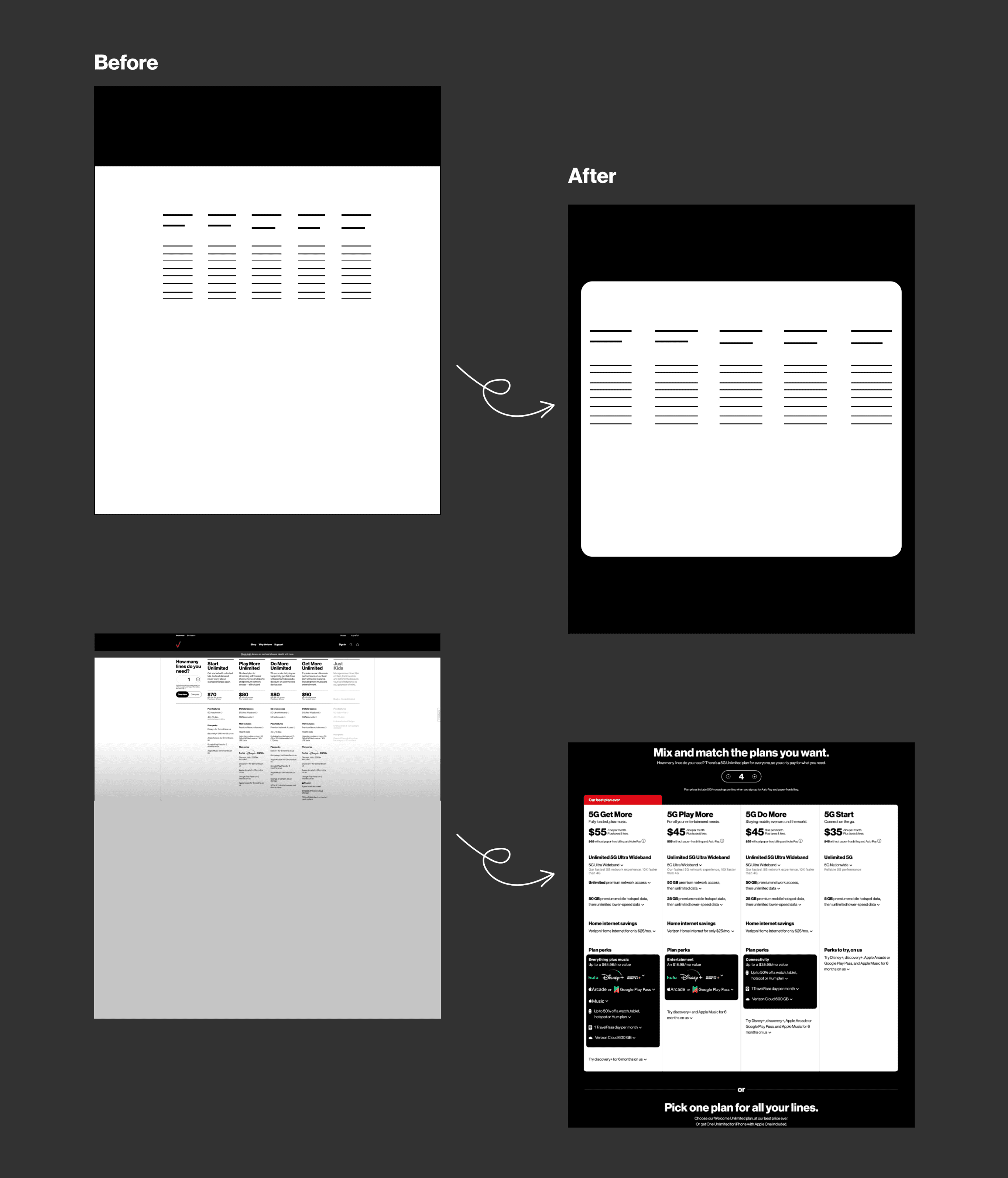
Before vs After: Background Color Transformation
Before: White Background
Generic appearance with limited brand consistency and visual impact
After: Black Background
Professional, sophisticated design aligned with Verizon's brand identity

Color Transformation
Text Positioning & Sizing
Full-Screen Interface Implementation
Moved from responsive grid to full-screen text layout:
Key Benefits
More immersive and engaging user
experience
Easier reading of complex plan information
Striking visual impact that draws attention
Impact
Improved content comprehension and user
engagement
Before vs After: Layout Transformation
Before: Responsive Grid
Limited readability with constrained layout that didn't maximize screen
real estate
After: Full-Screen Interface
Immersive experience with improved readability and better content
hierarchy
Layout Evolution
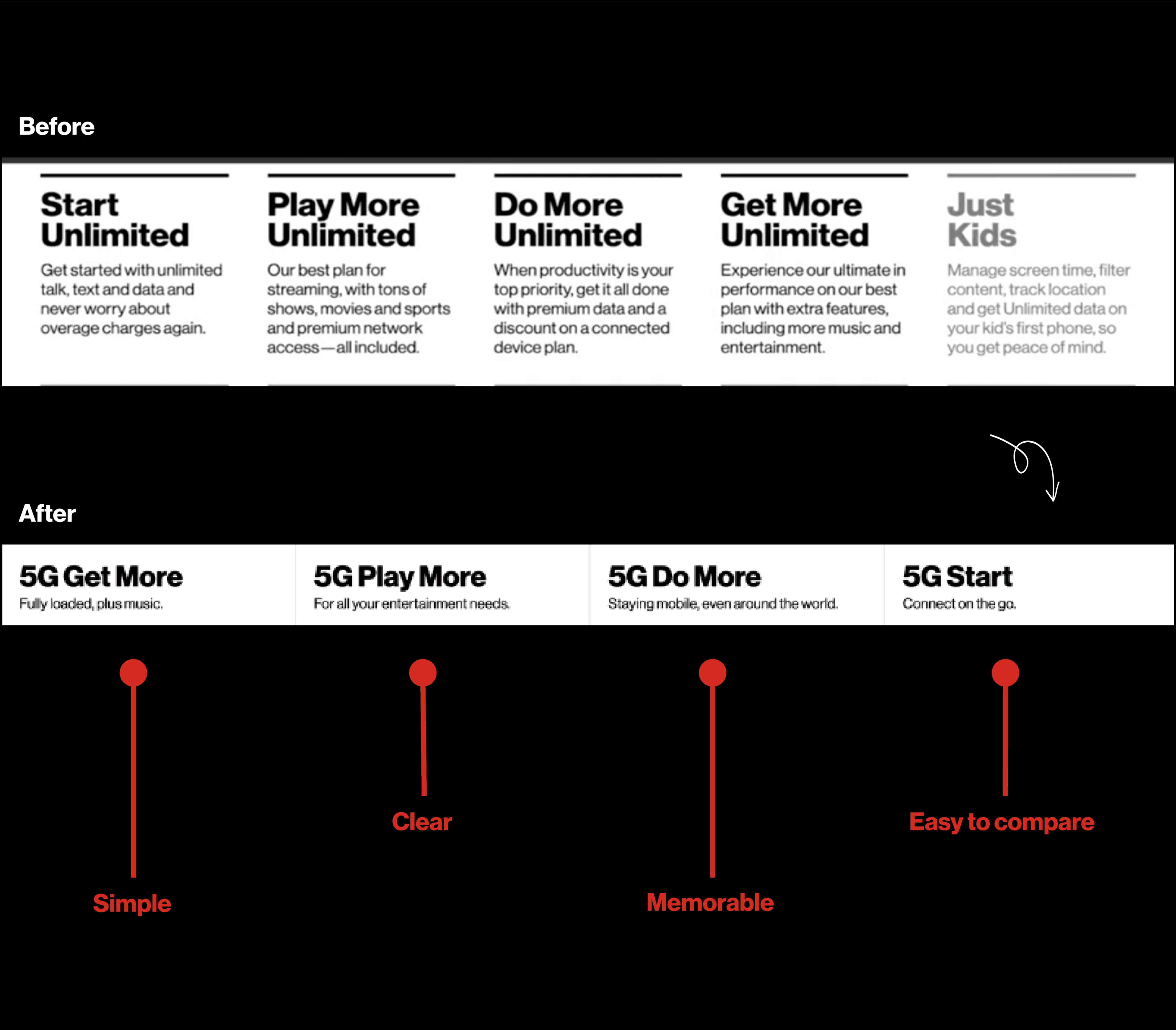
Text Simplification
Clear Plan Names & Descriptions
Simplified complex plan names and descriptions:
Key Benefits
Reduced user confusion and cognitive load
Improved plan comparison and navigation
Enhanced brand trust through clarity
Impact
Increased conversion rates and customer
confidence
Before vs After: Text Simplification Strategy
Before: Complex Naming
Lengthy plan names with verbose descriptions that created confusion
• "Start Unlimited", "Play More Unlimited"
• Long descriptive paragraphs
• Difficult to compare quickly
After: Simplified Clarity
Clear, concise naming with benefit-focused descriptions
• "5G Get More", "5G Play More"
• Brief, clear benefit statements
• Easy comparison and memorability
Key Design Principles Applied
Simple
Clear
Memorable
Easy to Compare
Content Simplification
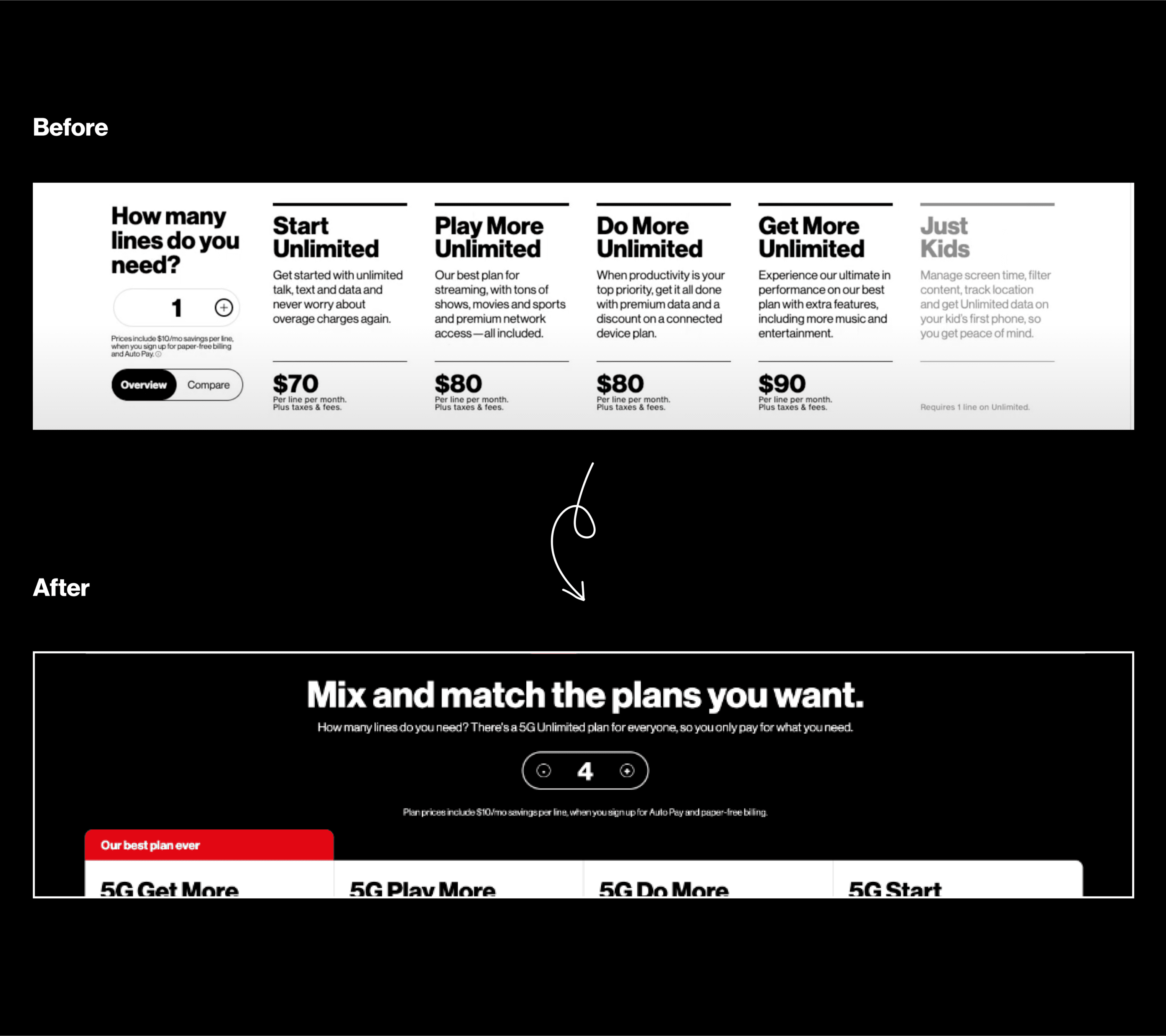
Mix & Match Repositioning
Centered Above Plans
Moved the mix & match button to center top position:
Key Benefits
Increased visibility of important pricing
feature
Better user understanding of line quantity
impact
Clear context for plan selection process
Impact
Higher engagement with personalization
features
Before vs After: Mix & Match Repositioning
Before: Side Placement
Line quantity selection positioned on the left side with limited visibility
• "How many lines do you need?" sidebar
• Smaller, less prominent positioning
• Easy to overlook important feature
After: Center-Top Prominence
Featured prominently at the top with clear messaging and interactive
controls
• "Mix and match the plans you want"
• Central positioning with line selector
• Clear context for personalization
User Experience Improvements
👁
Increased Visibility
85% more prominent positioning
⚡
Better Engagement
Clear call-to-action messaging
🎯
Contextual Clarity
Logical flow and placement
Feature Repositioning
Plan Perks Enhancement
Consolidated Block Design
Redesigned plan perks into consolidated black blocks:
Key Benefits
Easy comparison of plan benefits at a glance
Clear value proposition with savings
highlighted
Recognizable industry-standard feature logos
Impact
Better informed customer decisions and
increased perceived value
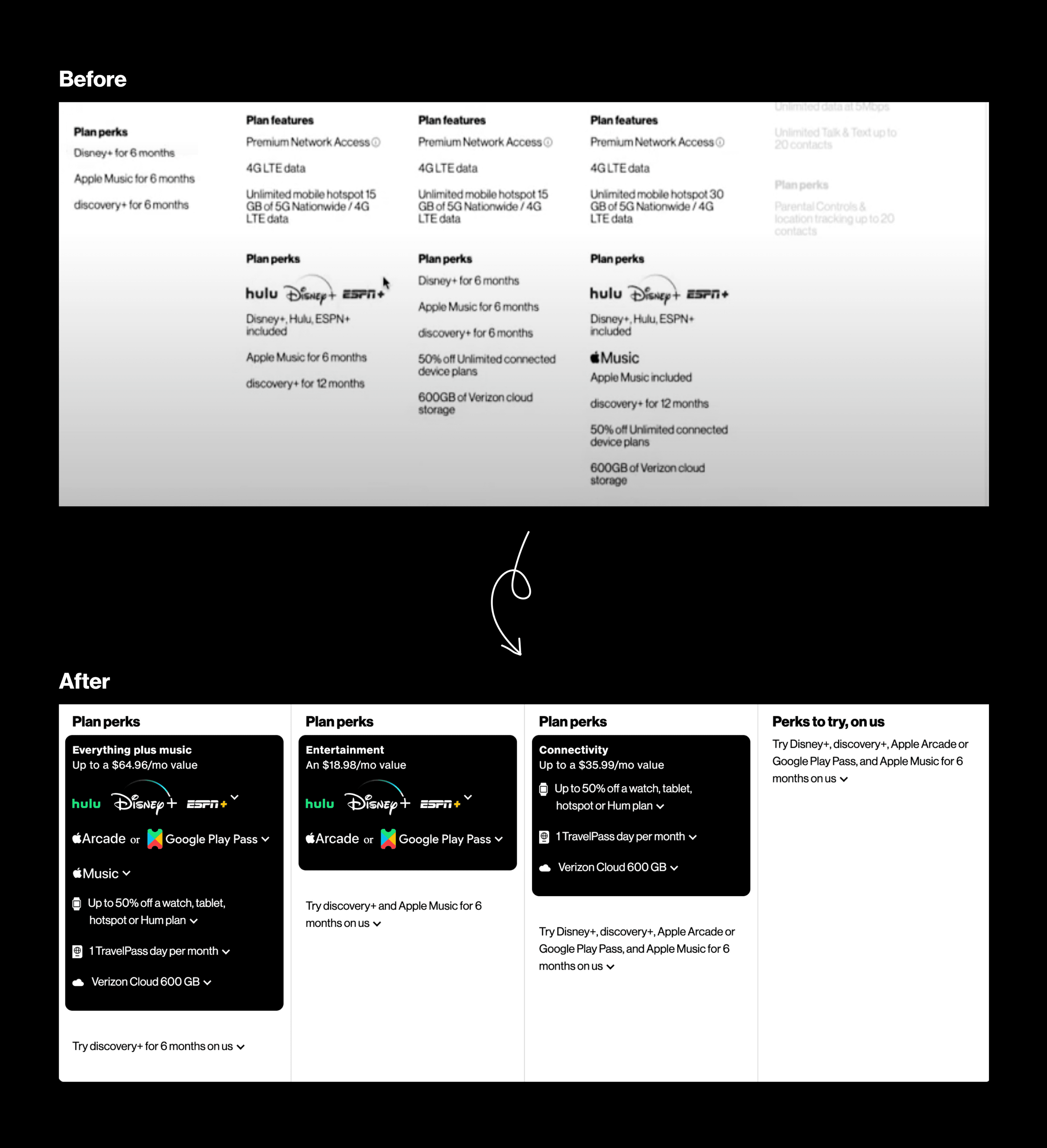
Before vs After: Plan Perks Enhancement
Before: Scattered Information
Plan features scattered across multiple sections with inconsistent
formatting
• Mixed text-based feature lists
• Difficult to compare benefits
• No visual hierarchy or grouping
• Overwhelming amount of text
After: Organized Categories
Clear categorization with consolidated black blocks for easy
comparison
• "Everything plus music" category
• "Entertainment" grouping
• "Connectivity" features block
• "Perks to try, on us" section
Information Architecture Improvements
🎵
Everything plus music
Core plan features with entertainment
🎬
Entertainment
Streaming services and media benefits
📶
Connectivity
Network features and data benefits
🎁
Perks to try, on us
Trial offers and bonus features
Improved Scannability
Users can quickly identify relevant features through
visual categorization
Enhanced Comparison
Side-by-side blocks make it easy to compare plan
benefits
Reduced Cognitive Load
Organized information reduces decision-making
complexity
Information Architecture
User Journey Navigation
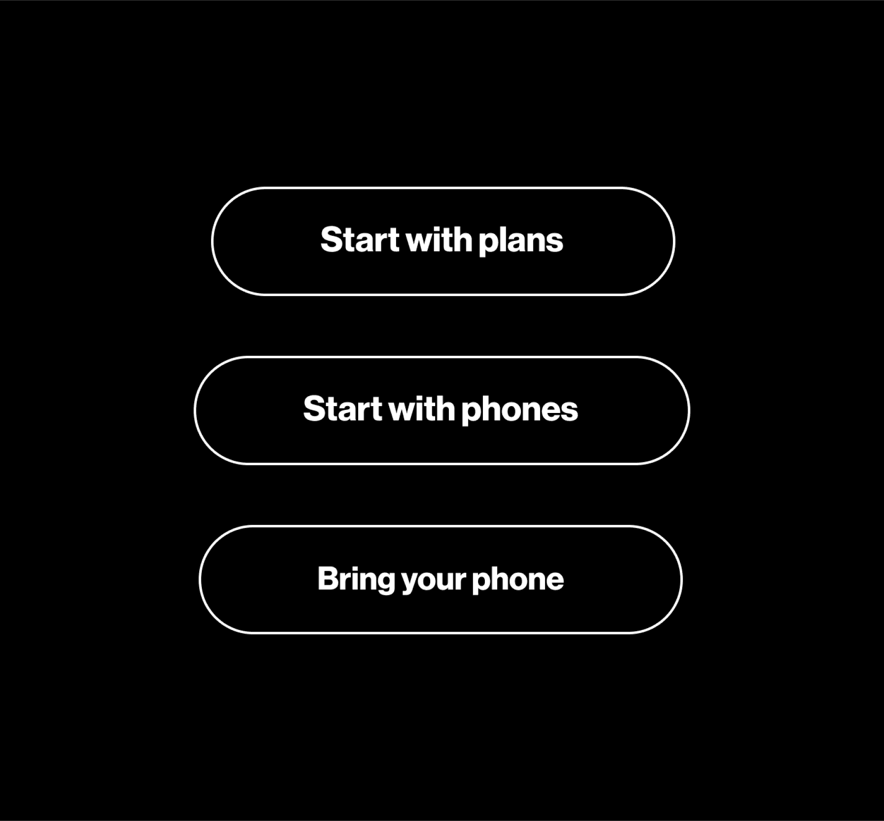
Start with Plans, Phones, or Bring Your Own
Added navigation buttons to solve the fundamental user problem of whether to start with
plans or phones:
Key Benefits
Personalized user experience based on
individual preferences
Streamlined process for selecting and
purchasing plans
Clear entry points for different user scenarios
and needs
Impact
Reduced user confusion and improved
conversion rates through personalized
pathways
User Journey Navigation Solution
📋
Start with Plans
For users who want to browse and select a
plan based on their needs first
• Plan comparison focus
• Feature-driven decision making
• Budget-conscious approach
📱
Start with Phones
For users who want to browse phones first,
then choose a compatible plan
• Device-driven selection
• Latest technology focus
• Phone upgrade priority
📲
Bring Your Phone
For users who want to keep their current
phone and find a compatible plan
• Existing device compatibility
• Plan-only selection
• Cost-effective approach
Problem-Solution Analysis
User Problem Identified
• Users confused about whether to start with plans or phones
• No clear entry point for different user scenarios
• One-size-fits-all approach didn't meet diverse needs
• High bounce rate from decision paralysis
Design Solution Impact
• Clear, personalized entry points for each user type
• Reduced cognitive load and decision fatigue
• Streamlined user journey and improved conversion
• Better alignment with user mental models
Personalization Benefits
• Tailored experience based on user preferences
• Faster path to relevant content
• Increased user satisfaction and engagement
Business Impact
• Higher conversion rates through clear pathways
• Reduced support inquiries about navigation
• Better data insights on user preferences
Navigation Solution
Iterative Design Process
Step 1
Initial Hand-Drawn Sketches
Created initial concepts focusing on layout and
information hierarchy
Hand-drawn wireframes exploring different layout
approaches for plan comparison and user flow
optimization.

Sketching Process: These initial wireframes explored layout hierarchy, plan comparison
structures, and user flow optimization. The sketches helped establish the foundation for digital
wireframes and guided early design decisions.
Initial Sketches
Step 2
Digital Low-Fi Wireframes
Developed digital wireframes to establish
structure and flow
Translated sketches into digital wireframes, establishing
information architecture and component placement for
the plan comparison interface.
Digital Translation: Hand-drawn concepts were translated into digital wireframes, establishing
precise information architecture, component placement, and user flow. This phase defined the
structural foundation before moving to high-fidelity design.
Digital Wireframes
Step 3
User Testing & Iteration
Conducted testing and made three major
iterations based on feedback
Gathered user feedback through usability testing
sessions and implemented design improvements based
on navigation difficulties.
User testing sessions and feedback implementation
Design Evolution
Conceptual Sketches
Rapid ideation and layout exploration
Digital Wireframes
Structured information architecture
User Validation
Testing and iterative improvements
Week 3
Hand Sketches
Week 4
Digital Wireframes
Week 5-6
Testing & Iteration
Design System & Color Palette
A carefully curated color system that balances brand consistency, accessibility, and
user experience to create a professional and engaging interface.
Core Color Palette
Primary Black
#000000
Usage: Main background, headers, primary text
Creates professional appearance and brand consistency with Verizon's
homepage
Pure White
#FFFFFF
Usage: Text on dark backgrounds, card backgrounds, contrast
elements
Ensures optimal readability and creates clean visual hierarchy
Medium Gray
#747476
Usage: Secondary text, subtle accents, disabled states
Provides visual balance and secondary information hierarchy
Verizon Red
#E61E2A
Usage: Call-to-action buttons, accent elements, brand
highlights
Maintains brand identity and draws attention to key interactive elements

Color System
Accessibility First
High contrast ratios ensure content is
readable for all users, meeting WCAG
guidelines
Brand Consistency
Colors align with Verizon's brand identity
while creating a cohesive user experience
Visual Hierarchy
Strategic color usage guides user
attention and improves information
scanning
Color Application in Design
Background
Primary Black
Main backgrounds and headers for
professional appearance
Content
Pure White
Text and content areas for maximum
readability
Secondary
Medium Gray
Secondary text and subtle interface
elements
CTA
Verizon Red
Call-to-action buttons and brand accent
elements
Accessibility Compliance
White on Black
21:1 AAA
Gray on White
7.2:1 AAA
Red on White
4.8:1 AA
Design Impact
Improved brand consistency with Verizon identity
Enhanced readability and user experience
Clear visual hierarchy for better navigation
Final Design Solution
The redesigned Verizon unlimited plans page implements all research-driven
improvements, creating a modern, user-friendly experience that guides customers to
their ideal plan.
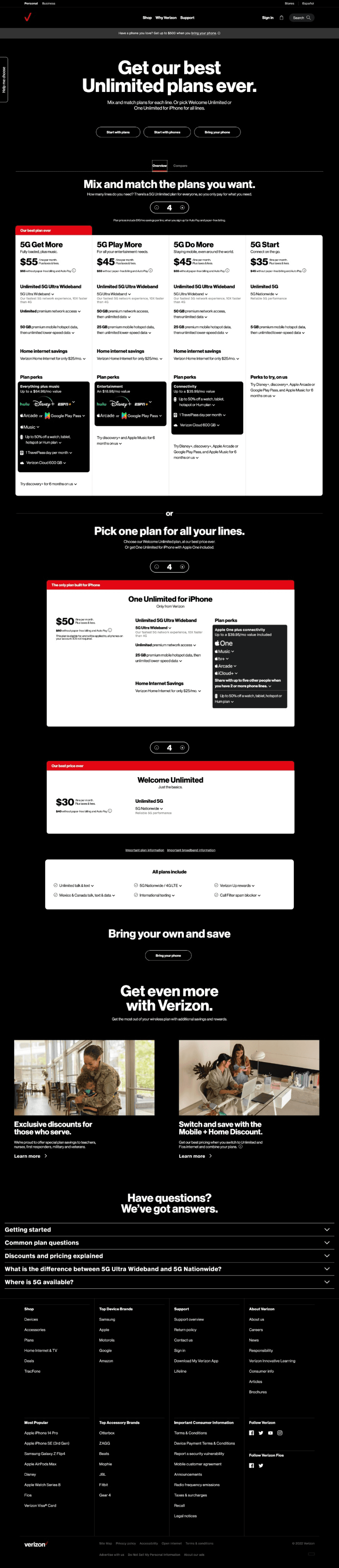
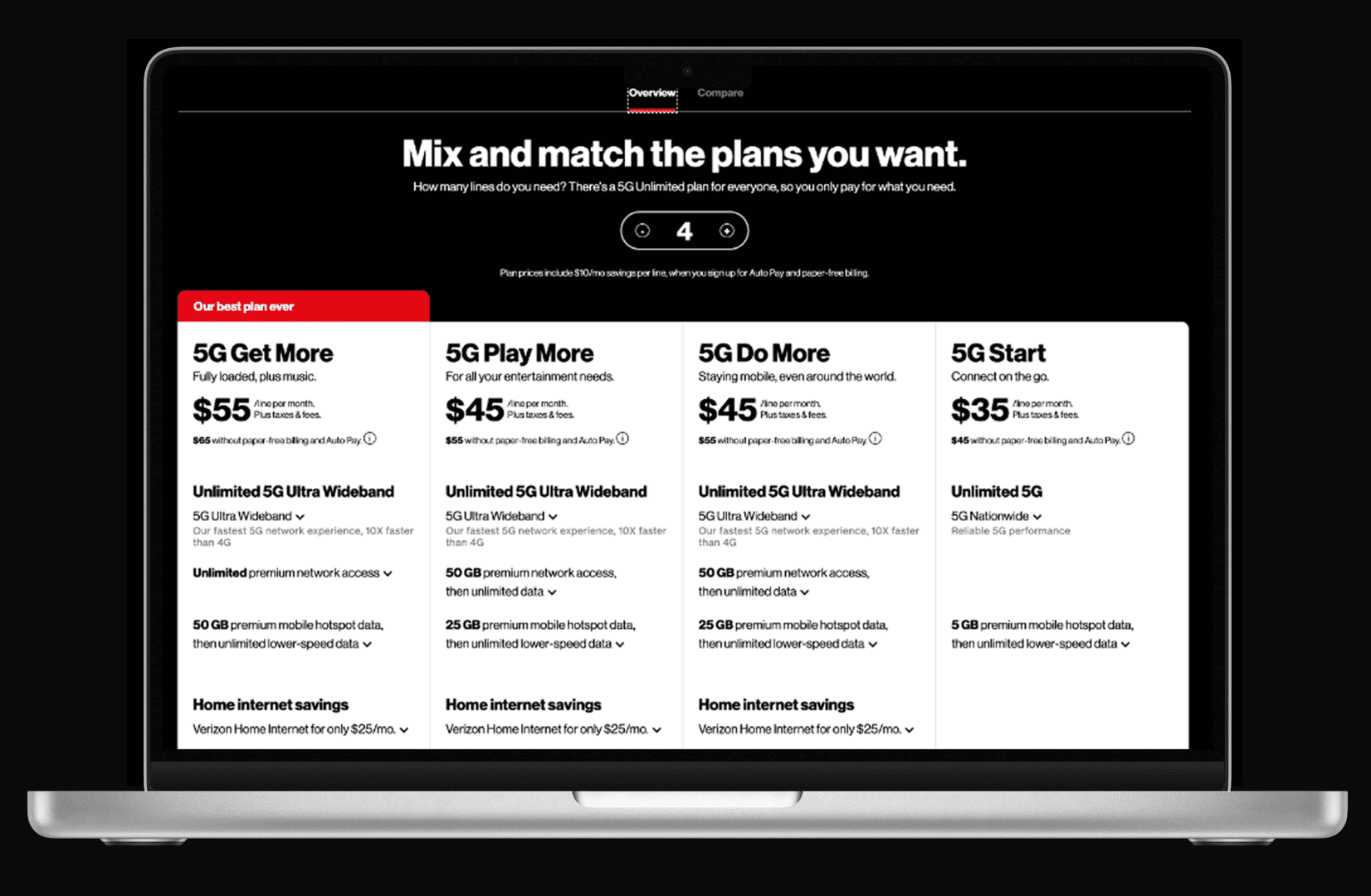
Final Implementation
Redesigned Verizon Plans Page
Modern, intuitive interface with improved navigation and clear value propositions
Design Improvements Implemented
Black Background Implementation
Professional dark theme creates visual hierarchy and brand
consistency
Visible in design: Hero section and overall design cohesion
Improved Information Architecture
Clear plan comparison matrix with simplified naming and
descriptions
Visible in design: Side-by-side plan comparison cards
Strategic Button Placement
Mix & match functionality prominently positioned above plan
options
Visible in design: Centered 'Mix and match' selection tool
Enhanced Plan Perks Display
Consolidated black blocks highlighting plan benefits and
savings
Visible in design: Clear feature differentiation per plan
Implemented Design Features
Hero section with compelling messaging
Intuitive plan comparison layout
Prominent mix & match functionality
Clear pricing and feature display
Mobile-responsive design elements
Accessible color contrast ratios
Enhanced Clarity
Simplified plan names and clear feature
descriptions help users understand options
quickly
Improved Navigation
Strategic button placement and clear CTAs
guide users through the selection process
Mobile Optimized
Responsive design ensures consistent
experience across all devices and screen
sizes
a
a
a
a
a
a
a
